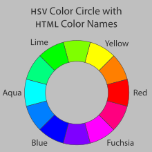
Color can enhance your poster and attract viewers, if used effectively.
You might use color to:
- improve the visual appeal of your poster
- improve the reader's ability to understand it quickly
- highlight important elements in your poster
- connect related information
- distinguish different categories of information
- present results in graphic form
- provide accurate images of examples from your work
Things to watch:
- don't overdo - very bright posters can draw attention, but may be difficult or tiring to read
- dark and brightly colored backgrounds can use a lot of ink when printing
- many prefer to read dark text on light backgrounds
- choose colors with sufficient contrast. Your text must be easily readable against the background, and colors on graphs and charts must be easily distinguished from each other.
- maintain a color scheme
- avoid using green and red next to each other to limit difficulties for those with color-blindness